Inside the creative mind of — Sarah Gottschalk
Berlin-based journalist, creative consultant, and interior enthusiast Sarah Gottschalk opens the doors to her colourful Kreuzberg flat – a vibrant space where nostalgia, instinct, and imagination come together. Read along for a peek inside the creative mind of Sarah Gottschalk.
A life in motion – a home in progress
Sarah Gottschalk is 37 years old and lives in Berlin with her two children, aged nine and five. After studying journalism, she co-founded the successful online magazine This is Jane Wayne with her best friend Nike van Dinther. These days, her creative focus has shifted: she writes a popular newsletter, curates content on Instagram and works as a consultant for various companies. While fashion was once her central passion, her interest has naturally evolved toward topics like interiors, architecture, and design.
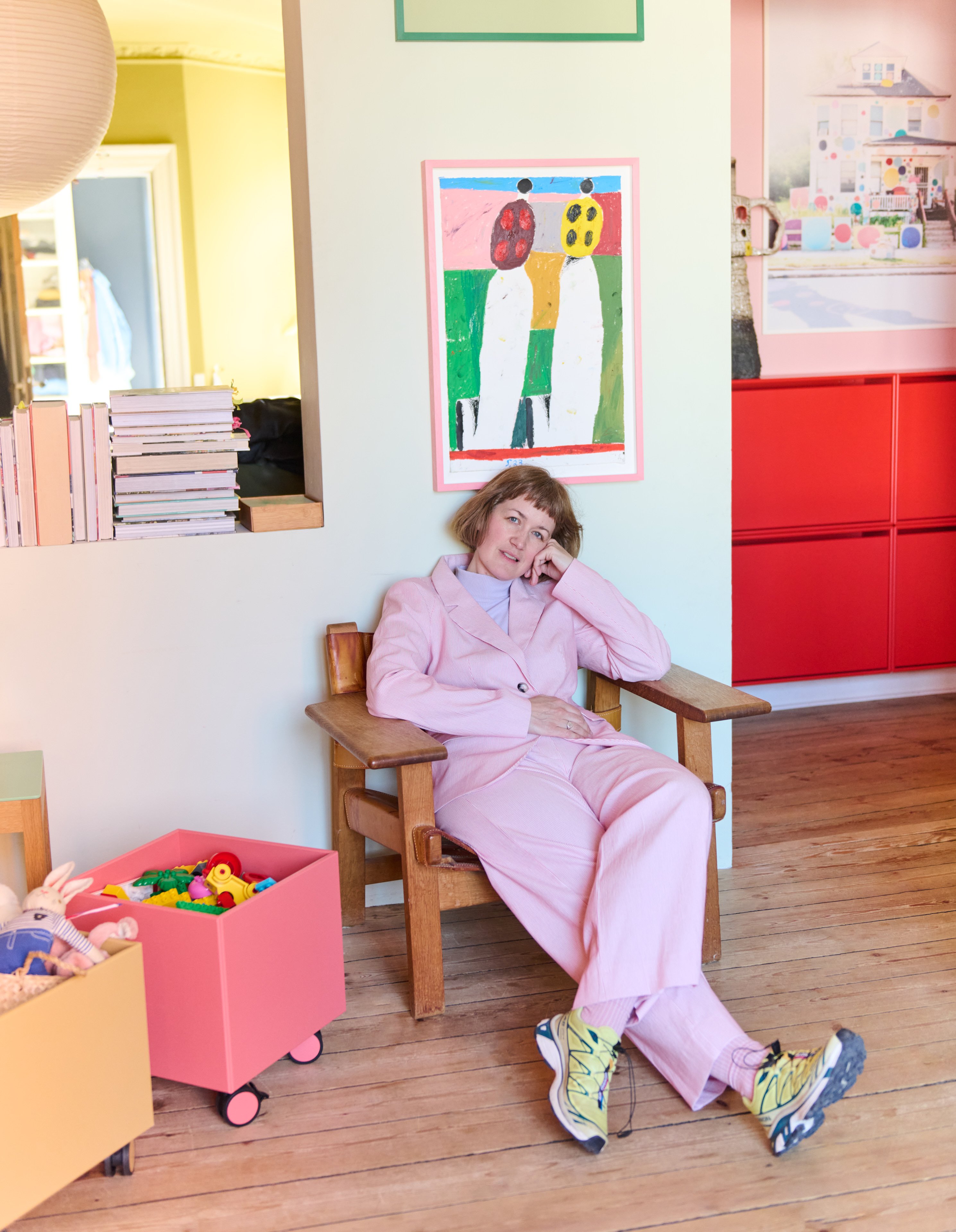
She lives in the heart of Kreuzberg, one of Berlin’s most multicultural and creative neighbourhoods. Her home is a 120-square-metre flat in an old building, which she and her family bought together. With high ceilings, classic floorboards, and ornate stucco details, the space instantly charmed her – and has since become her greatest ongoing project. Over the years, walls have come down, doors have been closed up, and even the hallway was transformed into a new room. For Sarah, this constant evolution is what makes the space so meaningful. The flat, in her words, will never be truly finished – and that’s precisely the point.


Colour as emotion – colour as language
From a young age, Sarah has had a vivid relationship with colour. Her childhood bedroom was colourful and full of life, and that aesthetic language has followed her ever since. Today, she approaches colour with a more refined sense of composition – intuitive, yet thoughtful. She’s developed an instinct for what works together and what certain combinations evoke emotionally. Working from home has made her especially aware of how colour shapes her environment. In her current flat, the walls remain coloured – though now with a subtler touch – while accessories and furniture continue to play with bolder hues.
Colour also plays a vital role in her professional life. Whether writing trend reports for clients or selecting her daily outfit, Sarah uses colour deliberately. Recently, she redesigned her living room: previously white-walled, it felt chaotic despite its colourful furnishings. With striped wallpaper and a red-painted ceiling, the room now feels grounded. She removed pieces that no longer fit, refining the space into something both vibrant and serene – the perfect backdrop for both work and family life.
My home is a reflection of all the things I love – and all the things I’m still discovering.


A home that speaks in layers
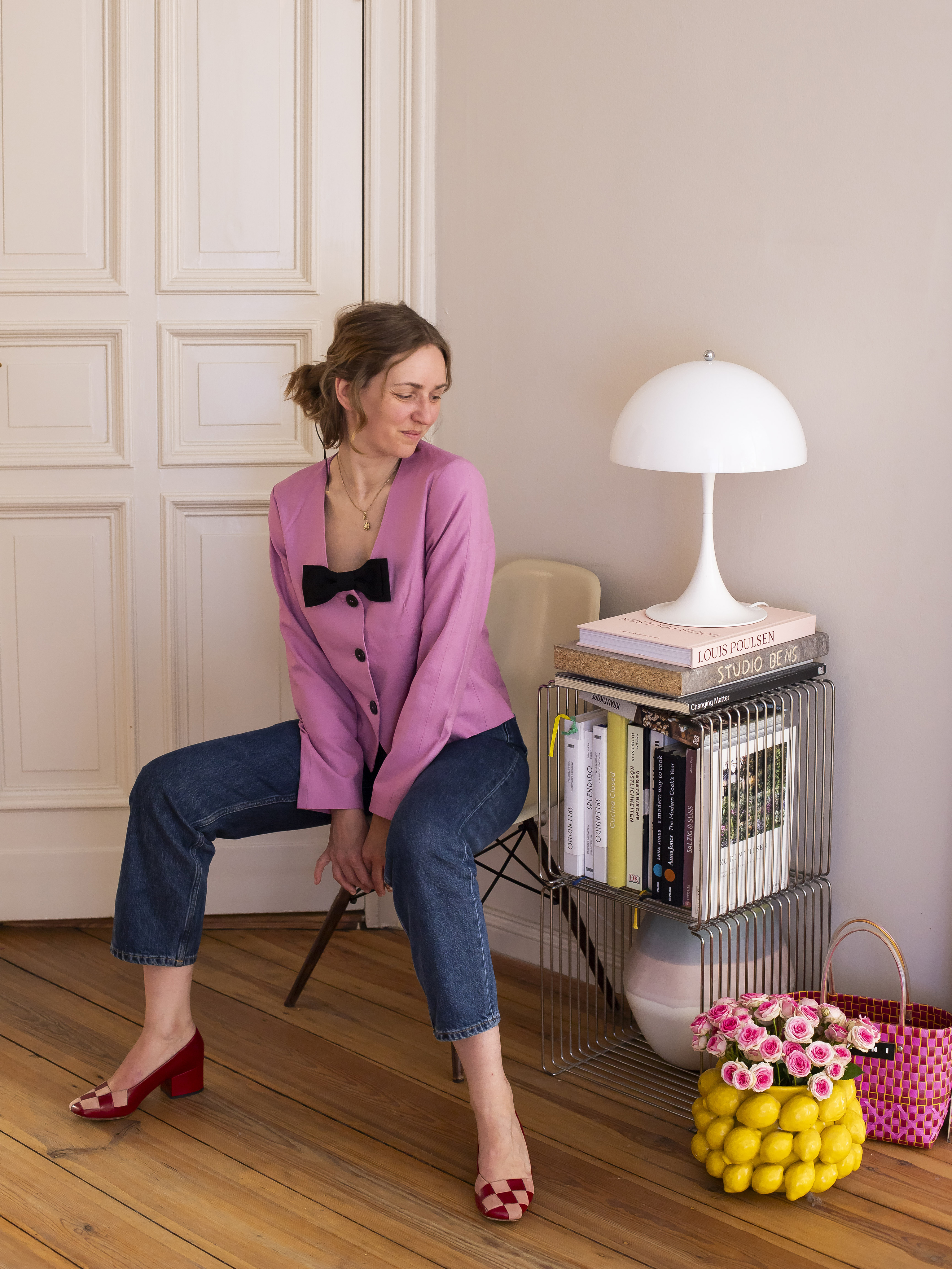
Describing her home, Sarah uses words like warm, inviting, cosy, and full of treasures. There’s a harmony to the way things come together – even when they surprise. The home isn’t designed around a single theme or strict aesthetic; rather, it’s a canvas for her personal handwriting. For Sarah, inspiration is fluid and ever-changing. Instagram is a constant source of discovery – from colour concepts to visual trends – while travel, art, and even political movements shape her design perspective. A recent trip to South Tyrol left a strong impression, and she finds herself continually inspired by visits to Copenhagen, a city she describes as endlessly beautiful and full of possibility.
There’s no strict blueprint or master plan for her interior style. Instead, she embraces freedom and experimentation. While some rooms are more neutral and others more expressive, each space reflects a different aspect of her identity. The thread that ties everything together is emotional honesty: everything she adds to her home comes from what she loves, what she’s drawn to, and what she longs for.
Do you like Sarah’s style? Find more inspiration on Instagram. Follow @sarah_jane.
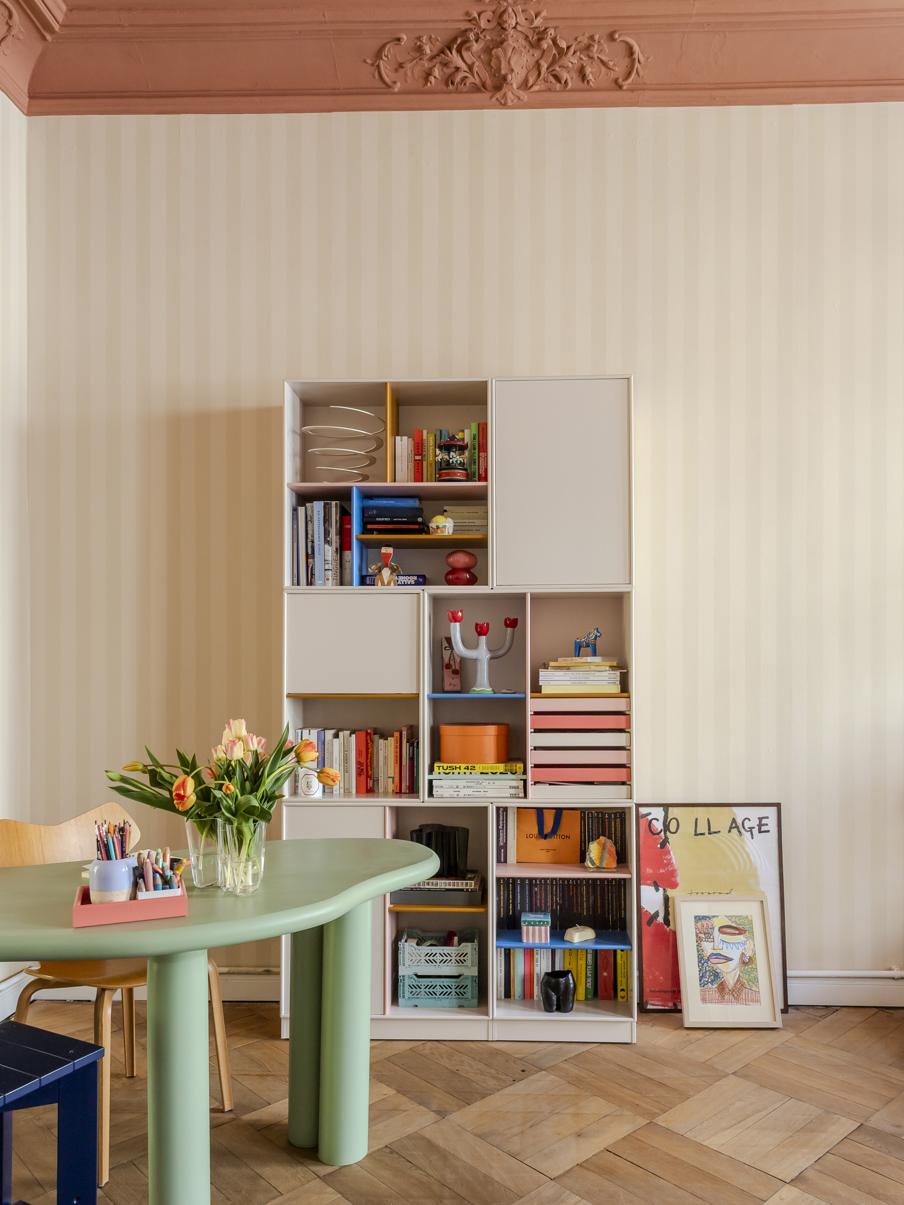

Sarah’s customised Montana System
Sarah has built not only a home, but a playground for ideas, mood, and creativity. With her Montana System she has put together the colours Vanilla, Ruby, Azure, Amber and Rhubarb.
Sarah’s three favourites
When choosing colours, Sarah relies on intuition – but also on a deep well of learned knowledge and visual memory. Her choices often emerge subconsciously but are grounded in experience. A current example is the decision to tile the balcony with turn-of-the-century-style blue ornaments – a response to her newfound craving for the colour blue, which had been missing from her home until now. For her, colour choices are not about rules, but resonance.
Asked to select three colours from the Montana palette that best represent her, Sarah names Vanilla, Azure, and Balsamic. Vanilla reflects her current love of buttery shades – soft, comforting, and full of warmth. Azure evokes everything from optimism to summer skies and the sea – symbols of rest, hope, and joy. Balsamic, a rich earthy brown, connects to her love of nature, chocolate, and all things cosy. Together, these shades express a perfect balance of brightness, calm, and depth.
I believe that colour makes people happy and if they haven’t dared to use colour yet, then perhaps it makes sense to start by adding small colour accents.


Less is never a bore
Panton Wire is the ultimate display shelf – designed by Verner Panton in 1971. Sarah’s is the chrome version, lives under the TV in her living room, and wears top panels so it can hold all her favourite pieces.
Sarah’s advice – Be bold with colour
When it comes to advice for others hesitant to embrace colour in their homes, Sarah is clear-eyed and honest. Not everyone needs to live in a colourful space, she says – but if the interest is there, it’s worth exploring. A bold red chest of drawers, for example, might become overwhelming over time and need to be rotated out – but it will never become irrelevant or dull. A white one, while neutral and safe, might end up being forgotten or thrown out entirely.
For those just starting out, she suggests beginning small: a colourful vase, bright flowers, or accent pieces that can slowly build confidence. Immersing oneself in visual inspiration helps too – but the most important thing is to understand that colour is not about correctness. It’s about what makes you feel something.
In Sarah’s view, the idea that neutral homes are more “timeless” is a misconception. To her, white-on-white spaces may be a safe bet, but they risk becoming interchangeable. Colour, on the other hand, carries soul, memory, and meaning – and when used thoughtfully, it can bring lasting joy.

Sarah lives by design that evolves and breathes
Her home is not just a reflection of her creativity – it’s a living moodboard of everything she values: curiosity, emotion, and an unapologetic love of colour.
Do you like Sarah’s style? Find more inspiration on Instagram.
Related articles